Sitecore XM Cloud —next-generation tab component

Hi
Very recently i got a request from a client that they are looking for implementing a Tab component in their JSS application. Those who have done work in Sitecore MVC or SXA, knows the power of this and we as a developer literally have every flexibility to apply any customization. Result of this is the ability to develop anything using this.
However, headless SXA has some limitation. For example, edit frame was not supported and very recent version of JSS sdk includes this capability. (21.x)
Now, i spend couple of hours to develop a very flexible yet powerful JSS Tab component. I call it, “Next generation tab component”.
Next Gen Tab component

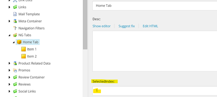
From the picture above, you see the datasource of the component. Idea is quite simple. You have a tab, which will have n number of tab items. Tab item will have several fields (which can be utilised as necessary). At the same time, we will allow a dynamic placeholder to be added inside each of the tab item. This will make the Tab component quite powerful.
Editing capabilities
Well, the idea was, we will allow the content author to do literally anything with this. At the very begining, they will see nothing but some general instruction to add tab items. The Edit frame plays a very vital role to achieve this goal. I also need to make sure any existing Tab item will have the ability to edit it and delete as well.
Edit Frame
Edit frame is quite popular yet powerful to allow a lot of editing work without writing a lot of code. Thanks to Sitecore to give us this amazing feature. When i looked into JSS, edit frame was quite new here. I searched a lot in website but really could not find anything quite useful. Let’s deep dive here to see how to add it in JSS, shall I?

If you expand a EditFrame component in JSS, you would see these properties. It’s not a lot. Now, if you compare this with the Sitecore MVC Edit frame, you would solve the puggle.
There are basically two types of Edit frame button:
- WebEdit
- Field Edit
WebEdit is handy when you are going to add child item, or parent item, delete them etc, whereas, FieldEdit will allow to edit a set of fields in a given item.
When you compare that above with this one below, you would find the same properties that used in the EditFrame component

const newTabItemButton =
{
    header: 'WebEditButton',
    icon: '/~/icon/Office/32x32/navigate_plus.png',
    click: "sxawebedit:new",
    tooltip: 'insert tab item',
    parameters: {"navigate": 0, "child": 1}
};
Check this code block. This tells that i am going to add an item as a child of my provided datasource id. The datasource here is “Tab” and the child would be my “Tab Item”.
const editTabItemButton =
{
    header: 'Edit',
    icon: '/~/icon/Office/32x32/pencil.png',
    tooltip: 'edit tab item',
    fields: ['Header', 'Tab Item Image', 'Desc', 'Cta1', 'Cta2']
};
Similarly, this one is a FieldEdit button which will allow us to edit a number of fields for given item id.
Once you sort out all, let’s glue together to create our Tab Component as below:
import React, { useState } from 'react'
import { ComponentConsumerProps, ComponentRendering, EditFrame, Field, GetStaticComponentProps, Placeholder, RichTextField, useComponentProps, withSitecoreContext } from '@sitecore-jss/sitecore-jss-nextjs';
import { GraphQLRequestClient } from '@sitecore-jss/sitecore-jss-nextjs/graphql';
import config from 'temp/config';
import TabHeader from './controls/molecules/TabHeader';
import { FaPlus } from 'react-icons/fa';


type TabsProp = ComponentConsumerProps & {
  fields: {
    HomeTab: Field<string>;
    Desc: RichTextField;
    SelectedIndex: Field<number>;
  },
  params: any;
  rendering: ComponentRendering
}

const newTabItemButton =
{
    header: 'WebEditButton',
    icon: '/~/icon/Office/32x32/navigate_plus.png',
    click: "sxawebedit:new",
    tooltip: 'insert tab item',
    parameters: {"navigate": 0, "child": 1}
};

const editTabItemButton =
{
    header: 'Edit',
    icon: '/~/icon/Office/32x32/pencil.png',
    tooltip: 'edit tab item',
    fields: ['Header', 'Tab Item Image', 'Desc', 'Cta1', 'Cta2']
};

const deleteTabItemButton =
{
    header: 'Edit',
    icon: '/~/icon/Office/32x32/delete.png',
    click: 'webedit:delete',
    tooltip: 'Delete Tab'
};

function NgTab(props: TabsProp) {
  const [selectedTabItem, setSelectedTabItem] = useState<any>({index: props?.sitecoreContext?.pageEditing ? props?.fields?.SelectedIndex?.value ?? 0: 0, tabItem: {}});
  const data = useComponentProps<any>(props.rendering.uid);
  const tabItem = data?.item.TabItems.results;
  if(tabItem){
    console.log("selectedTabItem", selectedTabItem);
  }

  return (
    <section id="tabs">
      {/* <!-- Tabs/Panels Container --> */}
      <div className={props.params?.ComponentClass?.value}>
        <div className={props.params?.OtherData?.value}></div>
        {/* Tab header */}
        <div className="flex flex-col justify-center max-w-xl mx-auto mb-6 border-b md:space-x-10 md:flex-row">
          {tabItem && tabItem?.length > 0 && tabItem.map((hc: any, index: number) => (
            <>
                {props.sitecoreContext?.pageEditing && (<>
                    <EditFrame title='Edit Tab Item' dataSource={{"itemId": hc?.id + ""}} buttons={[editTabItemButton, deleteTabItemButton]}>
                        <TabHeader  key={index}
                            onClick={() => setSelectedTabItem({index, tabItem: hc})}
                            componentClass={hc.fields?.ComponentClass?.value}
                            componentSubClass={selectedTabItem?.tabItem?.displayName == hc.displayName || selectedTabItem.index === index ? "py-5 border-b-4 border-softRed": "py-5 border-b-4 "} title={hc?.displayName}>
                        </TabHeader>
                    </EditFrame>
                </>
                )}
                {!props.sitecoreContext?.pageEditing && (<>
                <TabHeader  key={index}
                onClick={() => setSelectedTabItem({index, tabItem: hc})}
                componentClass={hc.fields?.ComponentClass?.value}
                componentSubClass={selectedTabItem?.tabItem?.displayName == hc.displayName || selectedTabItem.index === index ? "py-5 border-b-4 border-softRed": "py-5 border-b-4 "} title={hc?.displayName}>
                </TabHeader></>)}
            </>
          ))}
        </div>

        <div id="panels" className="container mx-auto">
            {props.sitecoreContext?.pageEditing && (<>
                <EditFrame  buttons={[newTabItemButton]} title='Add tab item' dataSource={{"itemId": props?.rendering?.dataSource + ""}}>
                    <div className='min-h-20 bg-gray-700'>
                        <FaPlus></FaPlus>
                    </div>
                </EditFrame>
            </>)}
            {!tabItem || tabItem.length === 0 && (
                <div style={{minWidth: "200px"}}>
                    <h1>[Empty component]</h1>
                </div>
             )}
        </div>
         {/* Tab Panel */}
         <div id="panels" className="container mx-auto">
            <>
                { selectedTabItem && selectedTabItem.index === 0 && tabItem && tabItem.length - 1 >= selectedTabItem.index && (
                <div style={{minWidth: "200px"}}>
                    <Placeholder name="tabpanel" rendering={props.rendering}></Placeholder>
                </div>
                )}
                {selectedTabItem && selectedTabItem.index === 1 && tabItem && tabItem.length - 1 >= selectedTabItem.index && (
                <div style={{minWidth: "200px"}}>
                    <Placeholder name="tabpanel2" rendering={props.rendering}></Placeholder>
                </div>
                )}
                {selectedTabItem && selectedTabItem.index === 2 && tabItem && tabItem.length - 1 >= selectedTabItem.index && (
                <div style={{minWidth: "200px"}}>
                    <Placeholder name="tabpanel3" rendering={props.rendering}></Placeholder>
                </div>
                )}
            </>
        </div>
      </div>
    </section>
  )
}

export const getStaticProps: GetStaticComponentProps = async (rendering, layoutData) => {
    const graphQLClient = new GraphQLRequestClient(config.graphQLEndpoint, {
        apiKey: config.sitecoreApiKey
    });

    const query: string  = '{ item(path: "{FFE4B0E2-1E5E-41A9-A6C0-DE946FA42294}", language: "en") {        TabItems: children { results { displayName ' +
        'path id fields { ' +
          ' jsonValue name value } } } } }' ;

    const result = await graphQLClient.request<any>(
        query, {
            datasource: rendering.dataSource,
            contextItem: layoutData?.sitecore?.route?.itemId,
            language: layoutData?.sitecore?.context?.language,
        }
      );
      return result;
};

export default withSitecoreContext()(NgTab);
Pay attention to this const getStaticProps: GetStaticComponentProps
If you notice that Tab Item basically organised as a child of the main Tab item. The easiest way to get it via a custom GraphQL queries. I was quite hesitent to use a straightforward query but a “component level data fetching” approach. This is important when you consider the performance. If you are not using SSG, you have to consider it either a direct component function or a integrated query. I would like to create a custom rendering content resolver to transform the additional data in that case.
Limitation
Well, this implementation has number of limitations, unfortunately. I will explore that later to fix but let me call out here:
- Dynamic placeholder: Currently, i did find any way to make this dynamically for the n number of Tab Item. I fixed this to 3 (pre configured) and used that based on the Tab changes event
- Change Tab Item in Edit mode: I guess it’s a common thing when you work in Sitecore. Experience editor normally will remove the custom events when it loads the component. You can either disable that by applying settings: “
<setting name="HtmlEditor.RemoveScripts" value="true"/>" (I did not test it) or try some alternatives
For my case, i introduced an extra field to support the dynamic Tab changing behavior in EE mode.
You can also trying adding this property to your rendering parameter template as well. Choice is yours.
Conclusin
I guess that’s all. Let me know if you have any questions.
Arif
Senior Solution Architect (Sitecore)
